Jan–Jul 2024

While a large number of users were successfully entering the product and reaching gameplay, a significant portion of them were not continuing beyond their first experience. This project focused on improving the first-time cash play journey, ensuring users not only start playing, but also understand the system well enough to continue engaging with confidence.
Overview
At a surface level, the funnel looked healthy — users were signing up, joining games, and interacting with the system. But deeper observation revealed a more fragile reality: users were moving forward with hesitation, often unsure of actions, system responses, and outcomes.
The real opportunity wasn’t just bringing users into the product — it was helping them feel oriented, confident, and in control once they were inside it.
The Problem
Despite strong initial engagement, the early user experience showed clear friction across multiple touchpoints. Users were able to enter gameplay, but struggled to complete it with clarity and confidence.
This was reflected in key metrics:
First-time cash play retention was low at
24%
indicating weak first-time experience
Turn timeout was high at
8%
suggesting missed or misunderstood actions
Drop-offs
occurred during
gameplay and post-game stages
These issues directly impacted user trust, repeat engagement, and monetization potential. The core problem was not functionality — it was lack of clarity across critical moments in the journey.
The goal was clear:
user understanding
gameplay confidence
cash-play retention
user understanding
gameplay confidence
cash-play retention
user understanding
gameplay confidence
cash-play retention
user understanding
gameplay confidence
cash-play confidence
Problem Framing
Field Work: Understanding the real problem
To move beyond assumptions and understand real user behaviour, we conducted on-ground research over 3–4 intensive days across high-density areas such as auto stands, residential clusters, and corporate surroundings.
4 Days
In-depth user Interviews
100+
Users
We interacted with a diverse set of users — drivers, security guards, office helpers, and first-time
RMG players, & capturing their natural behaviour while they downloaded, signed up, and played the game for the first time.
These conversations revealed hundreds of micro-moments of confusion, hesitation, and misinterpretation. This helped shift our perspective from analysing metrics to understanding how users actually experience the product in real-world conditions.
Key highlights
From the research, a few strong and recurring patterns emerged across different user groups:
Users were
Acting without understanding
System states (joined, turn, win) were
Not clearly visible
Timeout was often
Unintentional
Rewards and money flow created
Doubt instead of excitement
Small confusions across steps led to
Early drop-offs
These insights highlighted that the journey was not broken — but it was
“not self-explanatory enough for first-time users.”
What users experienced


Reimagining the “JOURNEY”
Based on these insights, the problem was reframed from improving individual screens to improving the overall journey experience.
The focus shifted towards designing an experience where users always understand:
Goal
From:
❌ “User should figure it out”
To:
✅ “System should guide when needed”
Solution
Solution

Prize Pool
₹32


i
YOU
Score
0
First Mover
Score
0
Second Mover


10:00


WEAK
Tap on tokens to move
Tap on the dice
My Contribution as a Lead Designer
My vision was to make the product intuitively understandable during use, rather than relying on pre-existing familiarity or external learning.
The goal was not just to improve usability, but to create a system where users could naturally build confidence as they progressed through the journey.


THE REDESIGN
Here’s how we transformed the experience:
Entry & FTCP Start Clarity
Signup success & reward confirmation

First Time Cash Play (FTCP) Start

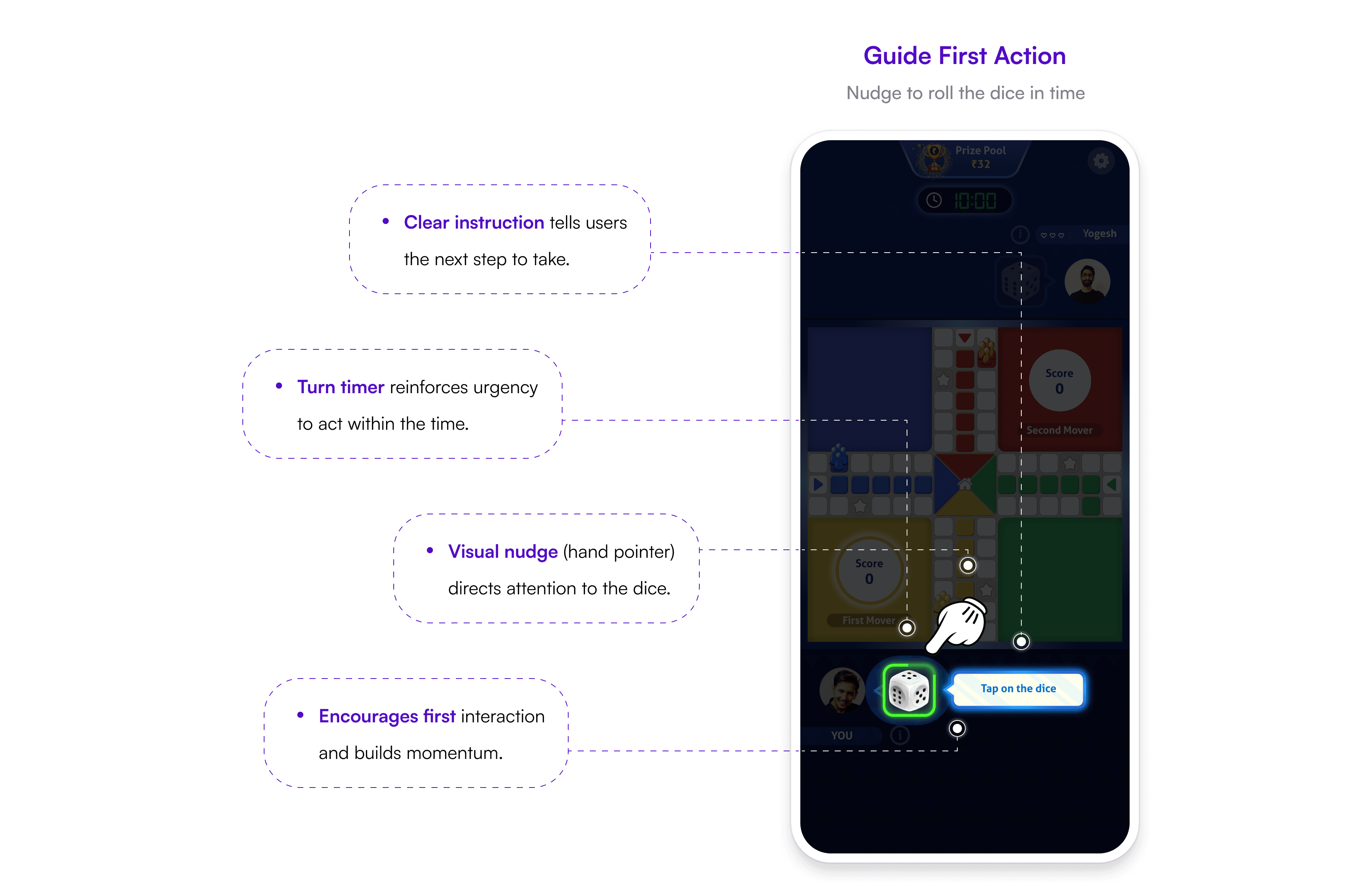
Gameplay Guidance & Turn Recovery



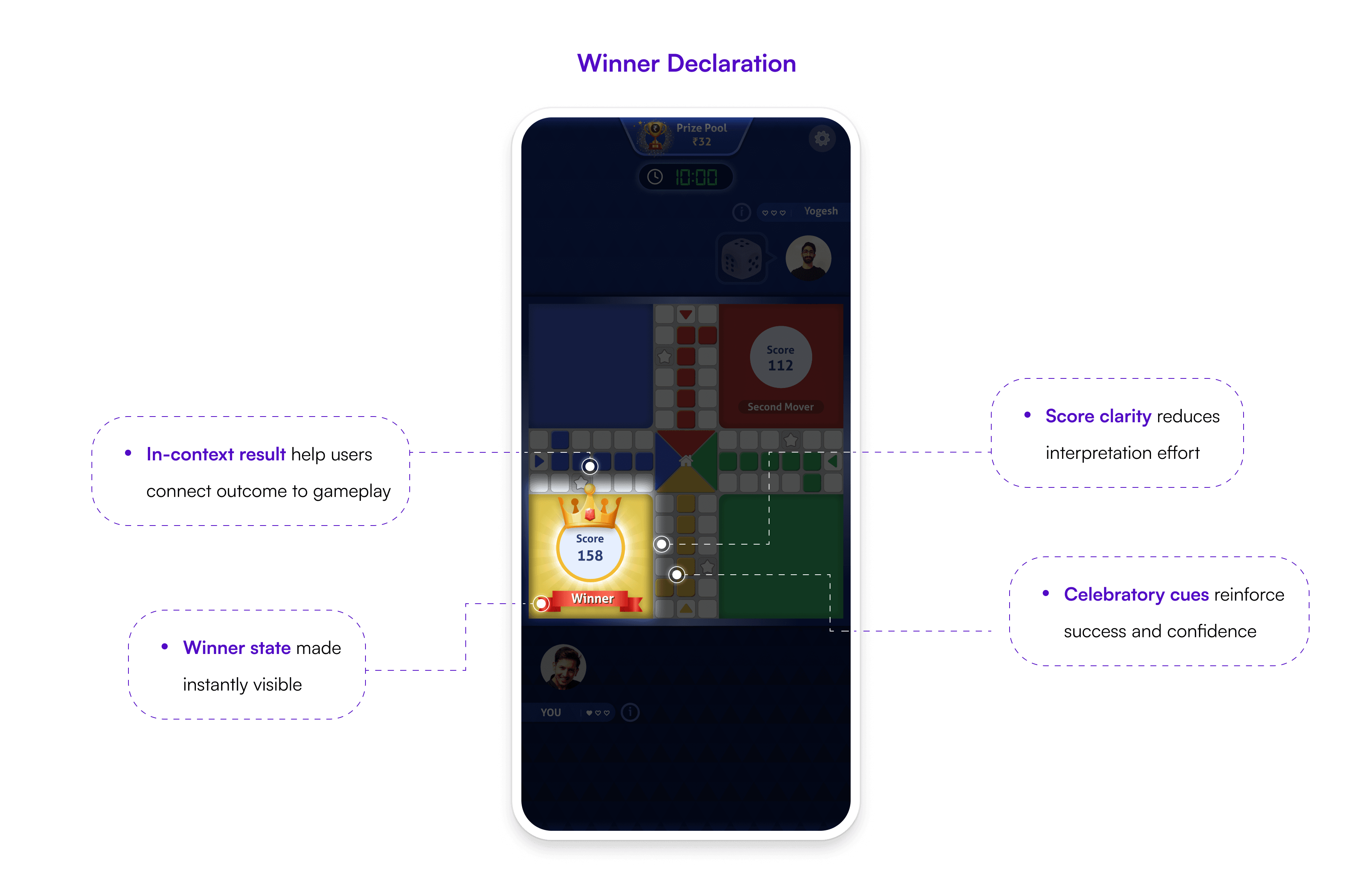
Post Game Clarity

IMPACT & RESULTS


METRICS
Daily & Montly
Metrics
Cadence
Before
After
Impact
FTCP Retention
Turn Timeout
Gameplay Conversion
ARPU
Monthly
Daily
Daily
Monthly
24%
8%
80%
₹40
52%
3.5%
90%
₹60
+28 pp
↓56%
+10 pp
+50%
Closing Thought
What started as an effort to reduce early drop-offs evolved into a deeper shift in how we approached the first-time user journey. By focusing on clarity at every step, we didn’t just improve usability — we helped users feel more confident, ultimately driving stronger retention and business impact.
“Sometimes, the biggest impact comes not from adding more — but from making things clear enough to trust.”